Problem + Opportunity
How a library aligned webpages to help visitors and researchers
The Free Library's Rare Book Department oversees and connects the public to the library's vast collection of historic objects and artifacts.
The Rare Book department casually expressed that they were not using a section of our site intended to provide the public with information about collections and related services. The Rare Book team shared their belief that visitors were not finding information so content on the site was often outdated and inquiries would be handled through in-person discussion or over the phone.
My Role
UX/UI Designer
Working closely with our subject matter experts and in-house Special Collection partners, I led efforts to better align public web pages to user needs. As the first dedicated UX/UI designer at the Library in many years, my perpetual goal with every project was to improve the UX maturity of the organization.
Methods
- Data collation and analysis
- Diagraming
- Heuristics
Platform
Public-facing, Responsive Website
Process
User Definition
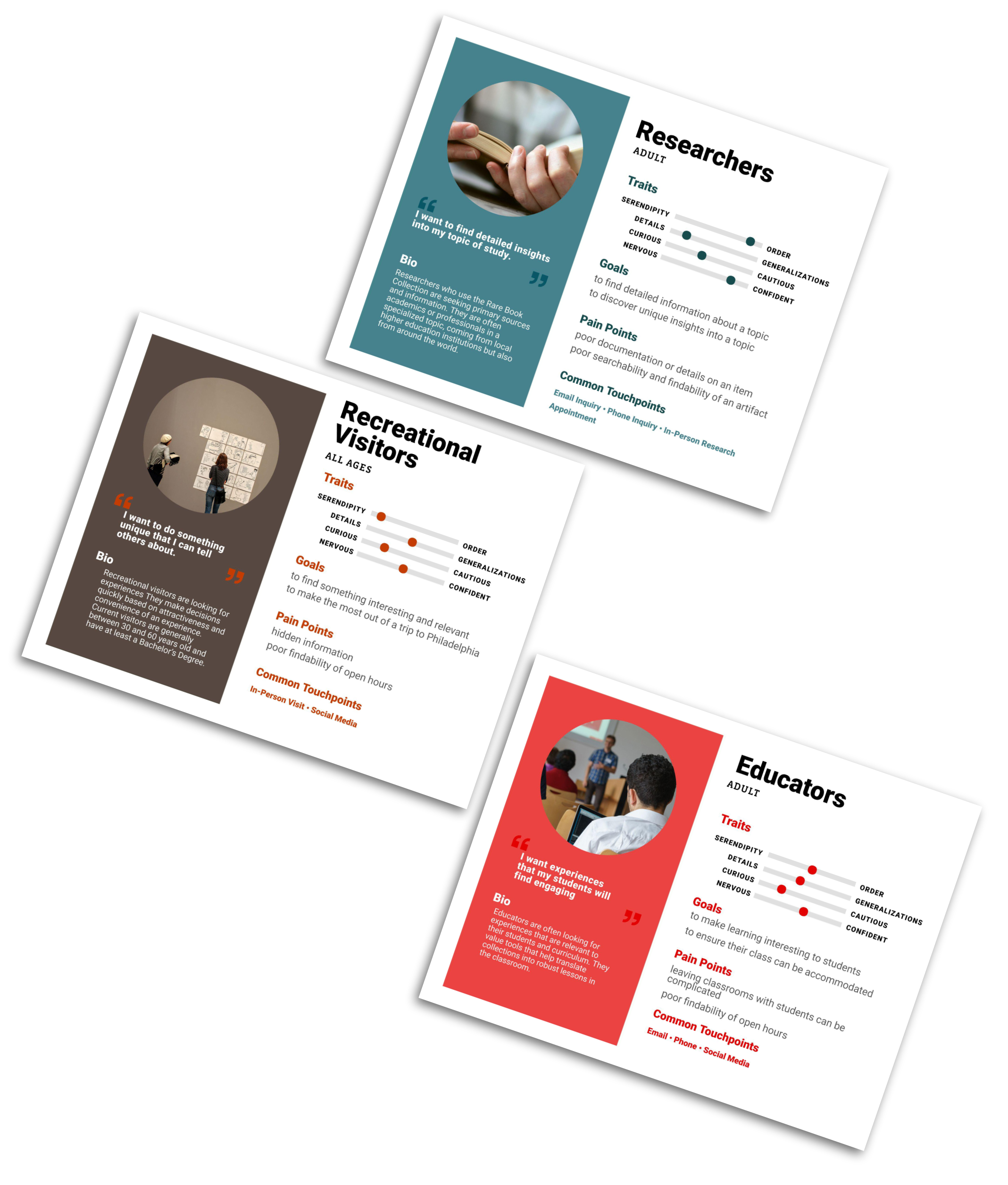
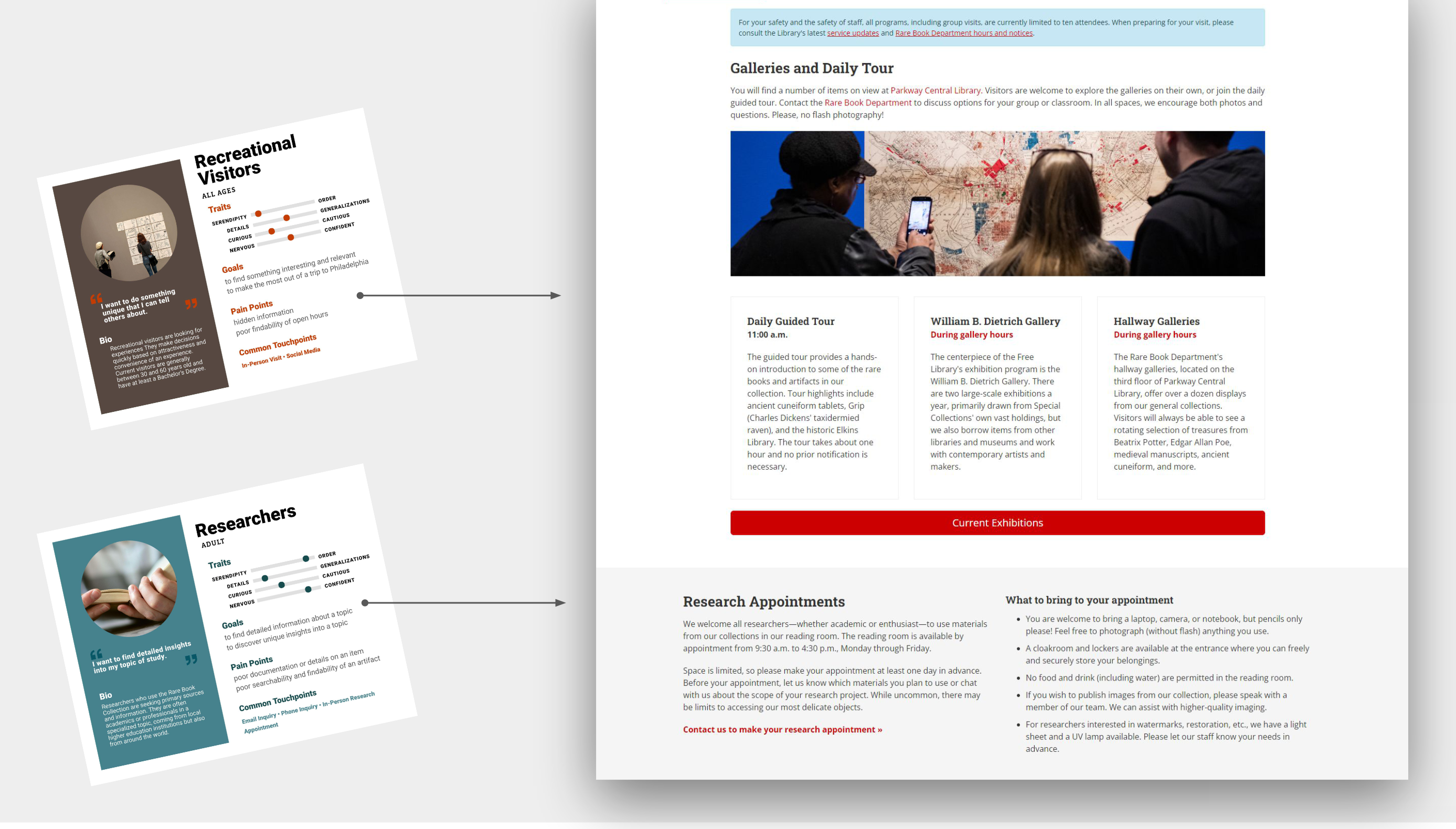
In a 40-minute discussion, I engaged the Special Collections team, asking them to tell me about their experiences engaging with visitors. Who did they serve? How did they initiate contact? What were they hoping to achieve? What challenges did they face when serving their audiences, if any?
From our conversation, we identified three distinct audiences: Researchers, Recreational Visitors, and Educators
Process
Discovery + Research
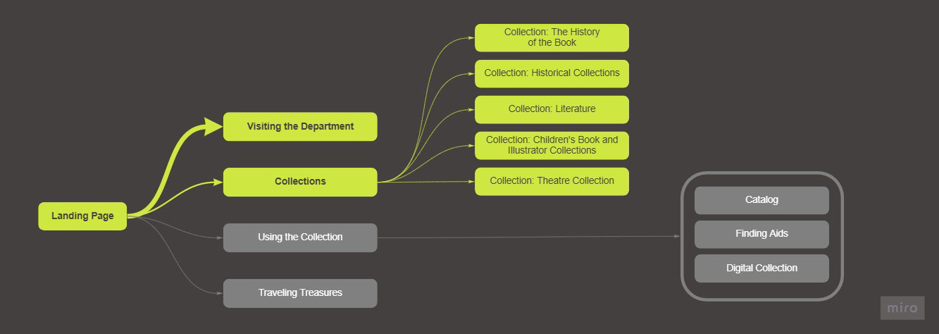
I tested the belief that visitors were not finding information. Using Google's analytics tool, I noted that visitors were indeed finding these pages, but only engaging in a limited amount of content in the section. Based on the content being explored, we translated this audience behavior into questions the audience was hoping to answer.
How can I visit a collection?
What is in the collection?
How can I search or engage with the collection?
Key Research Findings
How did research shape the design?
Not having direct contact with users meant we were instilling a lot of information from other sources, but this was a good first step for the organization.
I informally conducted a heuristic evaluation, logging my own notes and others that rose from discussions.
I interviewed the department's guest services desk to understand what questions they received, the related workload as a result of inquiries, how (if at all) they utilize the site currently, and their perspective on the current site and digital tools.
Surface essential information
Casual visitors were less likely to plan their visit than researchers or educators, but essential information such as open hours were buried on text-dense pages.
Accommodate educators
Analytics suggested that visitors were finding pages, but often bounced quickly from the pages. Information for educators was particularly buried or not represented.
Help visualize the collections
Library holdings should not accommodate a single Researcher audience, but instead be accessible to all interested audiences.
Continued research
Digital tools and resources were not being used, but without further user insights we did not have enough information to determine why.
Process
Design
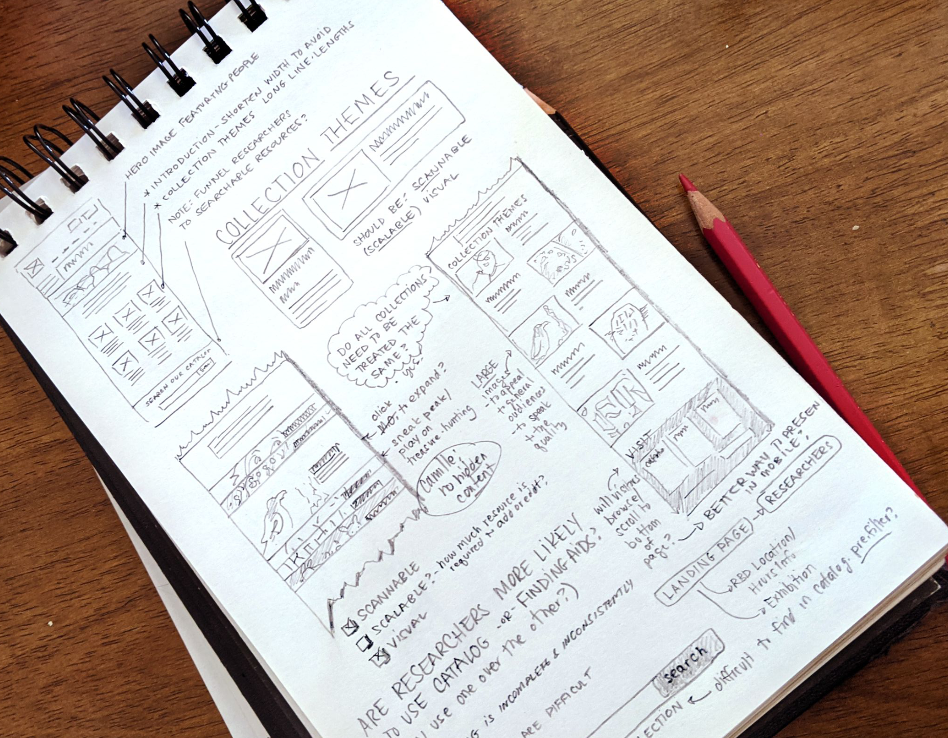
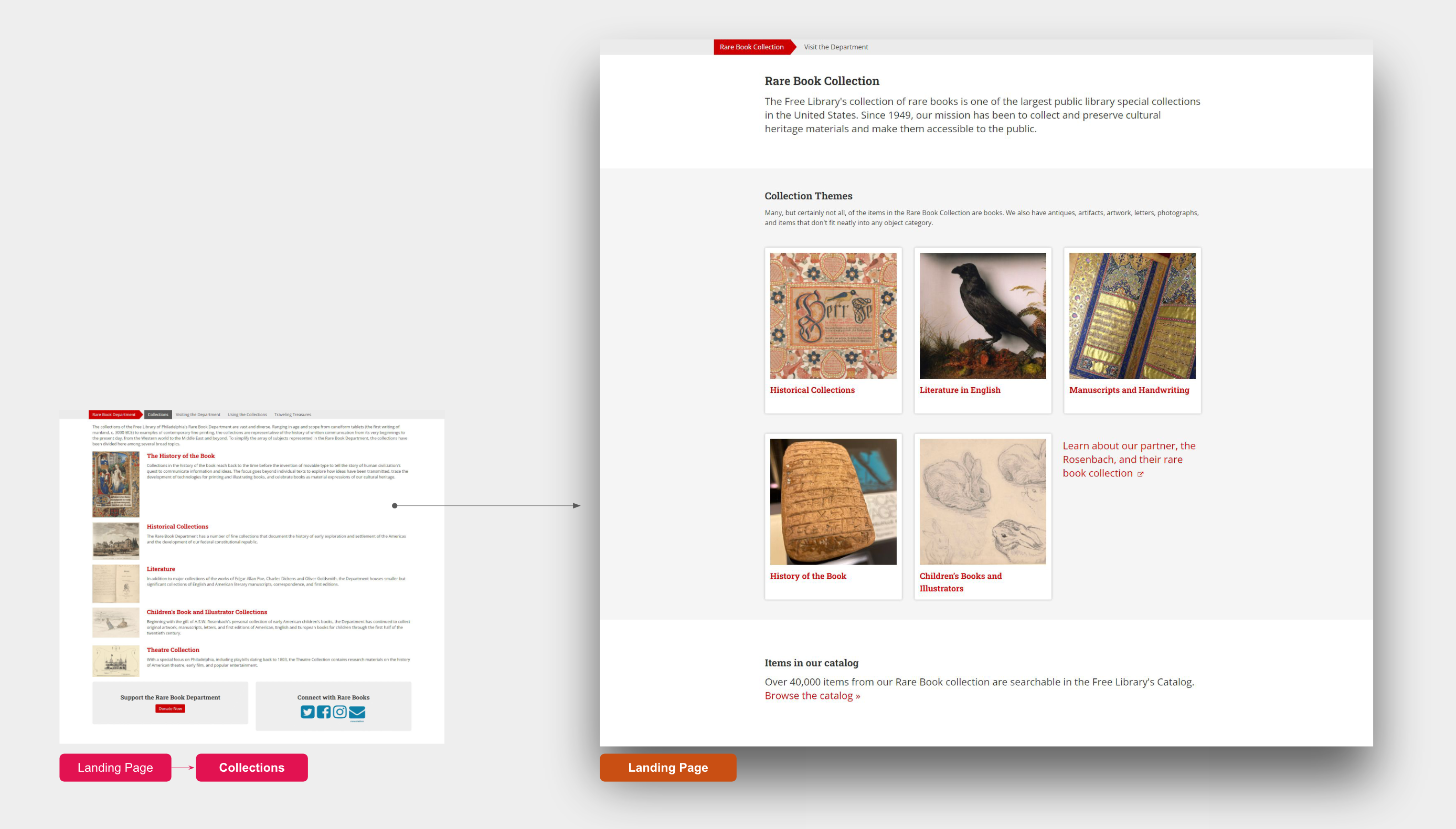
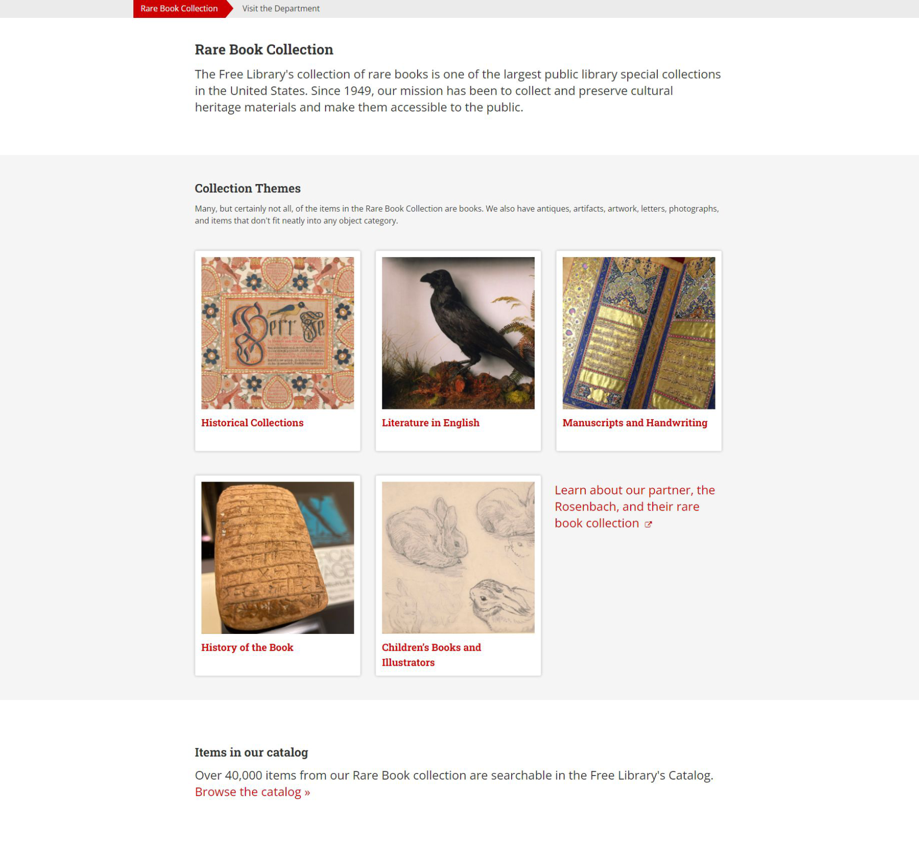
A major aspect of our redesign involved reducing the amount of text in favor of expressing information visually or in more concise manners. On the landing page, we traded over 500 words for a "snapshot" of the collection in the form of large, clickable areas with high-quality photos.
Recognizing that recreational visitors were less likely to plan their visit than researchers, on-site attractions, such as the exhibition spaces and daily tours, were reorganized into more digestible segments and provided links to hours and directions.
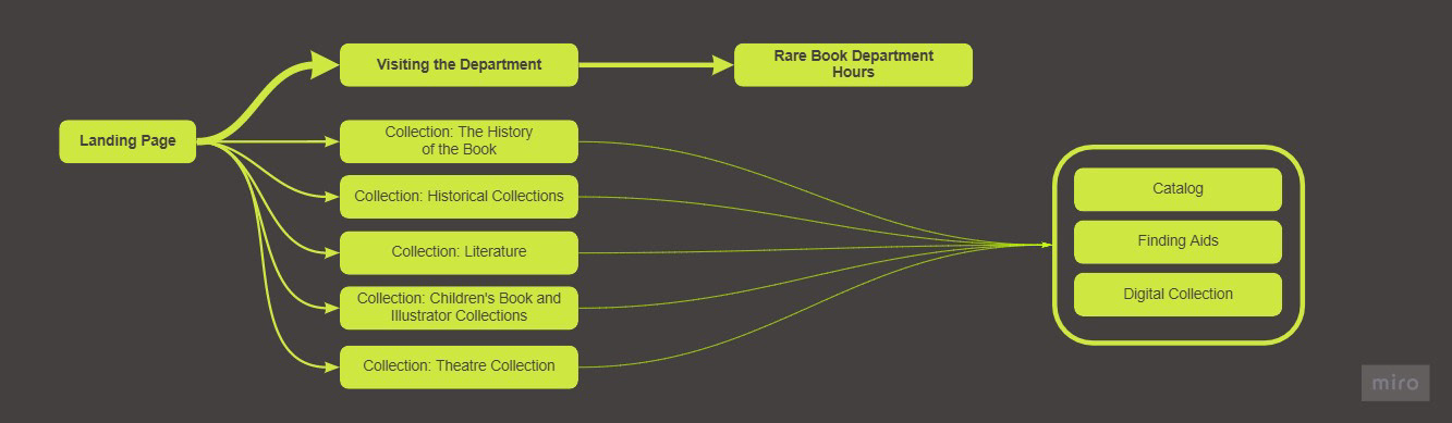
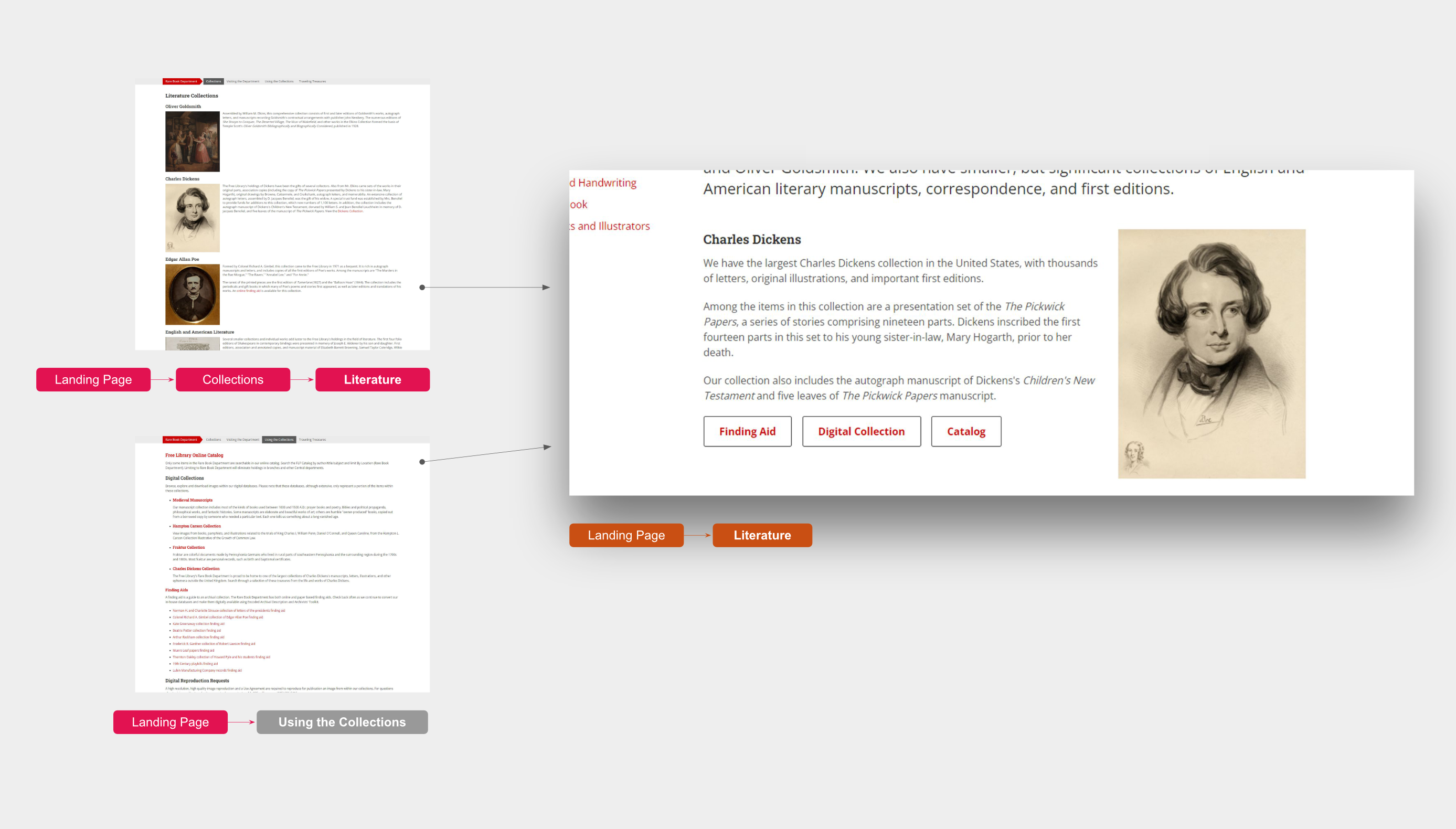
Links to additional digital tools and resources on specific topics were previously housed in their own section. We extracted this information and paired it with related topics on the collection detail pages.
Results & Achievements
What changed because of this?
This project has yet to launch, but my hope is that our efforts will begin to better answer the questions our visitors have when coming to these pages. From my perspective, a significant win for this project occurs beyond the screen, developing a solution that our Rare Book Department is proud of and eager to promote to their partners and researchers.
Had I continued with the team, I'd be eager to know if and how their help desk inquiries may have been impacted, if casual visitation had increased to the public collections, and how web analytics to these pages may have evolved.
To learn more about this project, reach out.
kristy.graybill @ gmail.com